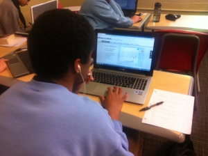
I wanted something that would open up the world of scatterplots to my statistics students; something where they could really get a sense of correlation and causality. I decided to do a project based around the fantastic GapMinder World and it payed off.
First I showed this video of the master Hans Rosling at work with the graphs his foundation came up with.
I then gave these instructions to my students:
You (and max one other person) are to prepare a 3 minute presentation on a GapMinder graph of your choice.
Instructions:
- On a computer go to the gapminder website by clicking here
- Play around with the explanatory and response variables until you find two that you think show some sort of relationship
- If you are struggling to find variables with a link, click ‘Open Graph Menu’ and play around with graphs that have already been created.
- Your presentation must include answers to the following questions
- What are your explanatory and response variables?
- What is the link between variables at the start (before you click play)?
- What do you notice happens over time?
- Are all the countries close together or more spread out? What does this mean?
- Are there changes to any particular country that are of interest to you?
- What if you isolate by continent? Are there any changes that are of interest to you?
- Is there anything else that stands out with your graph?
- Are there any outliers to the trend?
- Does this graph bring up any other questions that you would want to investigate further? What information would you need to answer these questions? Is this information available?
Your presentation must include the time series animation (when you press play) as well as PowerPoint slides using screen shots of points of interest.
You will be graded on:
- Content (out of 6)
- Presentation (out of 4)
What went well
- This was a great way to get across a sense of scatter graphs and will be awesome to segway into taking about correlation and causality.
- This was enjoyed by the students and really got them thinking about statistics and global affairs
- It was good to give specific questions for the students to answer. In my experience just saying ‘present for 3 minutes on a graph of your choice does not give great results’
Even Better If
Next time I do this, I think it would be good to model what an excellent presentation looks like. I missed a good opportunity to teach this skill.

